![]()
![]()
Original
records
If you're looking at the original records and find them hard to read, then there's not much we can offer you in the way of advice, other than, to use a magnifying glass. If you're looking at yellowed images, it's possible to take a photograph using black and white film. The image will often be more clear. Using special film, you can increase contrast making yellowed writing much clearer. The more you practice reading these kind of records, the easier it will become.
Microfilm records
If possible, get a print out, these can be easier to read. Some microfilms are shown as negatives, you see white writing on a black background. Again, a black and white photograph taken, will reverse the effect and give you a more legible copy.
Poor quality images on the Web
Here's an
example of a census record we found on the Web - only a small area is shown.
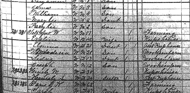
This is an image of the 1881 census for Vernon Parish, Louisiana in the USA. Unfortunately, the original books were damaged in a fire and this is one of the few which survived. You can see the smoke damage. Often, a similar effect is caused by mould or water. If you have the original, you can brush off the mould which makes it much clearer but, in this case, the original document was photographed and this is all that was available to us. To make matters worse, whoever put it on the Web, saved the images as gif files. This limits the colour tones to 256 colours - it also produced a larger file size - big mistake! Please, if you're putting photographs on the Web, save your images as .jpeg, .jpg or .png files (although older browsers may not be able to see .png images), otherwise, as you can see, it's not very easy to make out the text.
If you have the image on your computer, try loading it into a program such as Paint Shop Pro. If you cover the original with a new layer, completely filled with white and then make that layer, about 50% transparent (adjusting until it's easier to read), then you can get an image like this:
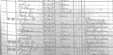
By experimenting with other colour layers and filters in Paint Shop Pro, it is possible to get an even clearer image but, this is very subjective, different people see it in different ways. Need help altering your graphics? - contact us.
The page headings came out like this:
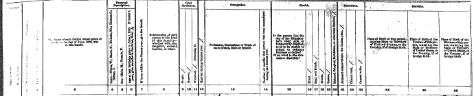
This is as good as it gets, if you magnify it, you only get a blur:
|
1:1
|
3:1
|
|
|
 |
You can look at the magnified image through something like, a nylon stocking held close to your eyes and often be able to make out the image more clearly. You should be able to make out that this column is to do with the relationship to the, 'head of house'.